Role
User Research
Product Strategy
UI Design
Interaction Design
Usability
Tools
Figjam
Notion
Maze
Figma
Timeline
5 weeks
The 20-day cold shower experience pages were too complicated for the user to understand which was resulting a retreat from the challenge.
The Solution
The solution was to make the experience of the challenge easier by making the user follow steps in order to reach their challenge.
Usability Review
To help me better understand the product, I conducted a usability review to identify pain points and wow moments in the existing experience
Business & User frustrations
Following the usability review I defined the primary and secondary business and user frustrations
Primary Frustration
When the users arrive to the cold shower settings screen they are given too many options and they are spending a lot of time trying to figure out what to do, which is resulting in retreat from the page hence, the user is not upgrading to the Premium plan.
Secondary Frustration
When the challenge starts, users are not very clear on what to do which results in withdrawal from the challenge.
Competitor Benchmarking
With a usability review complete, I moved on to competitor benchmarking to help me identify standards in competitor products that could be used to improve the existing experience.
Problem Space
Who is affected by the problem?
The new user.
What is the problem?
Too many options in the cold shower settings screen that are not easy to understand.
Where does this problem occur?
In the cold shower settings screen.
When does the problem occur?
When the user is trying to select their preferred options.
Why does the problem occur? Why is the problem important?
It occurs because there are many options and CTAs.
It is important as it is one of the main screens - this is the first screen the user starts the journey with.
How Might We reduce the friction in the cold shower settings screen?
Ideation
To avoid following the first idea I conducted a series of ideation techniques. This allowed me to consider an array of solutions. Following ideation I mapped what could be improved or added to the product and what the impact of each idea would be for users and the business.
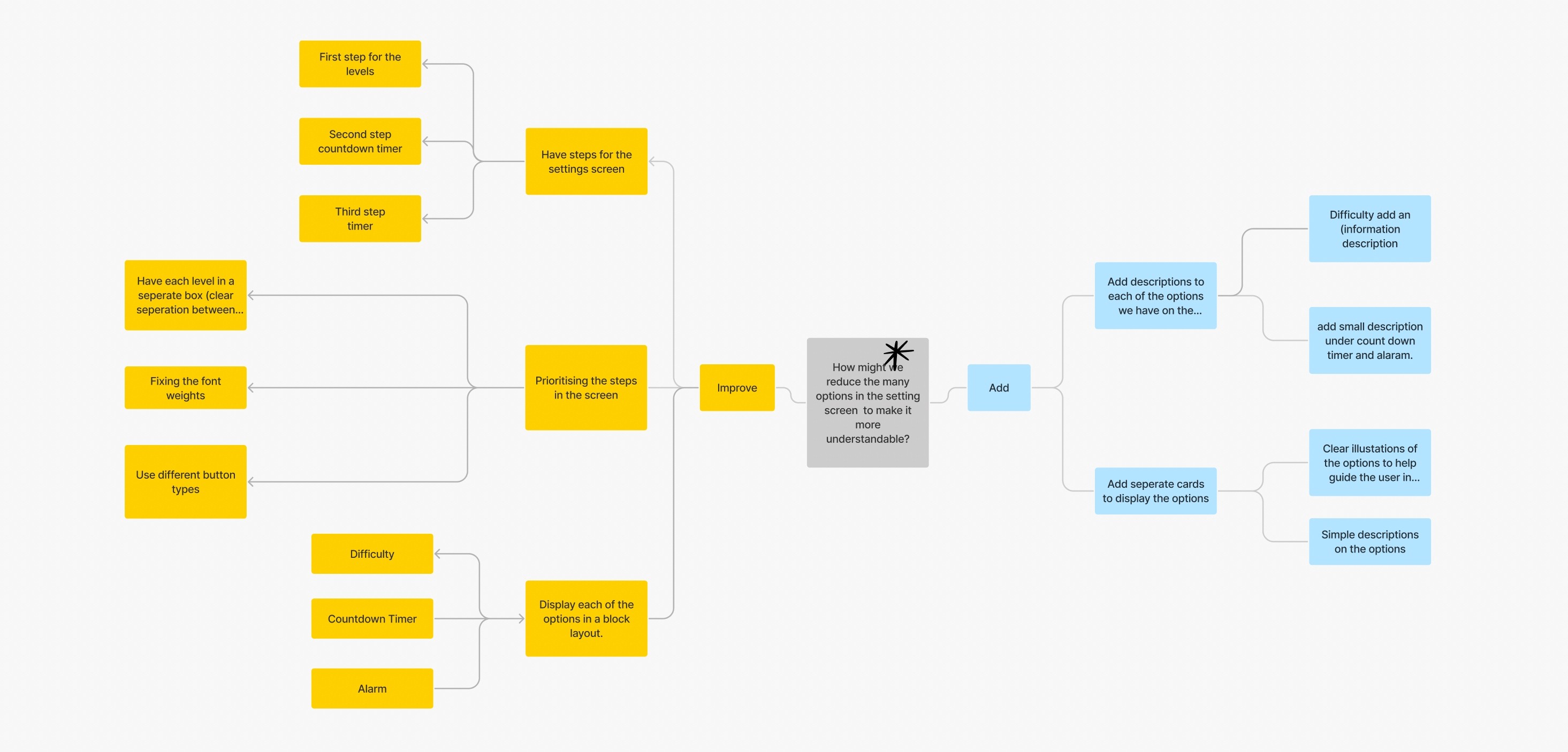
What can we add
Add descriptions to each of the options we have on the cold shower settings screen
What can we improve
Have steps for the cold shower
settings screen
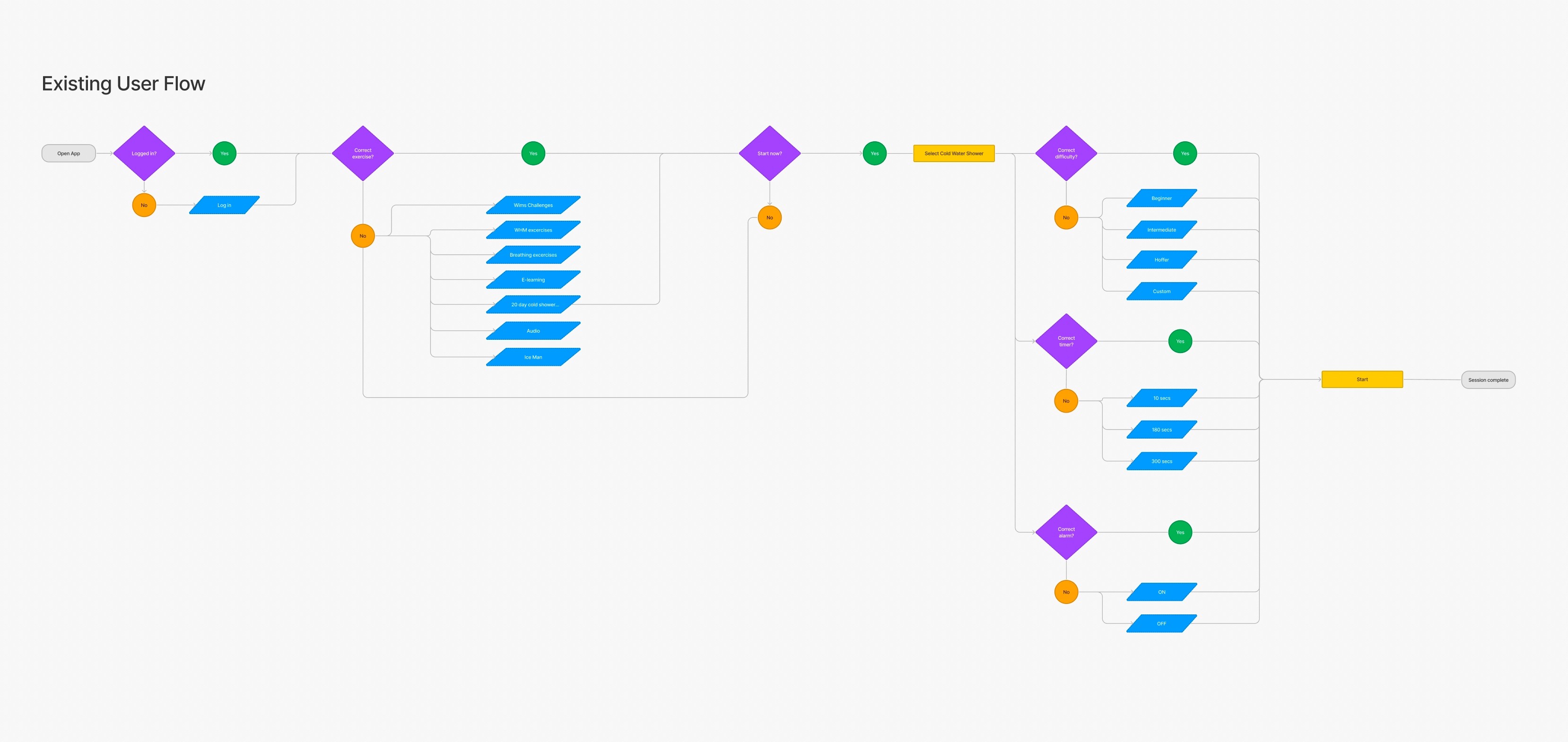
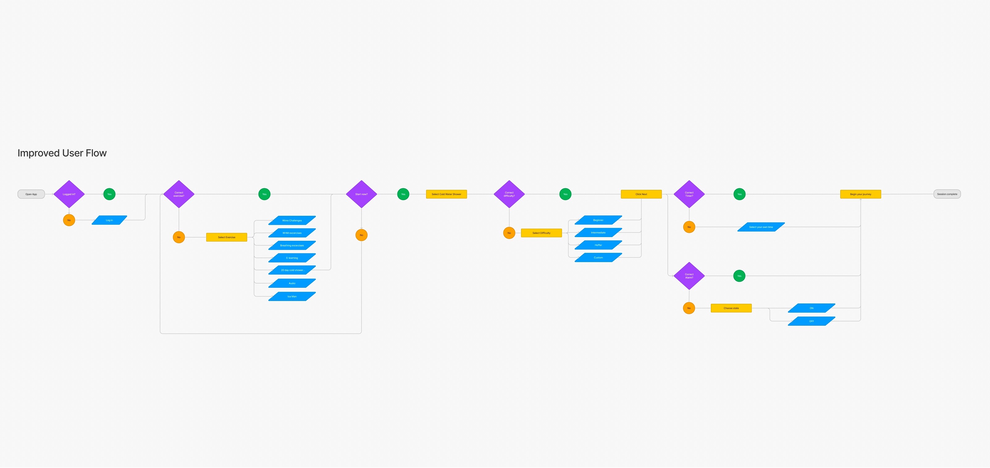
User Flows
Following Ideation I created user flows of the existing experience and improved the flow based on the idea that fit with business and user goals
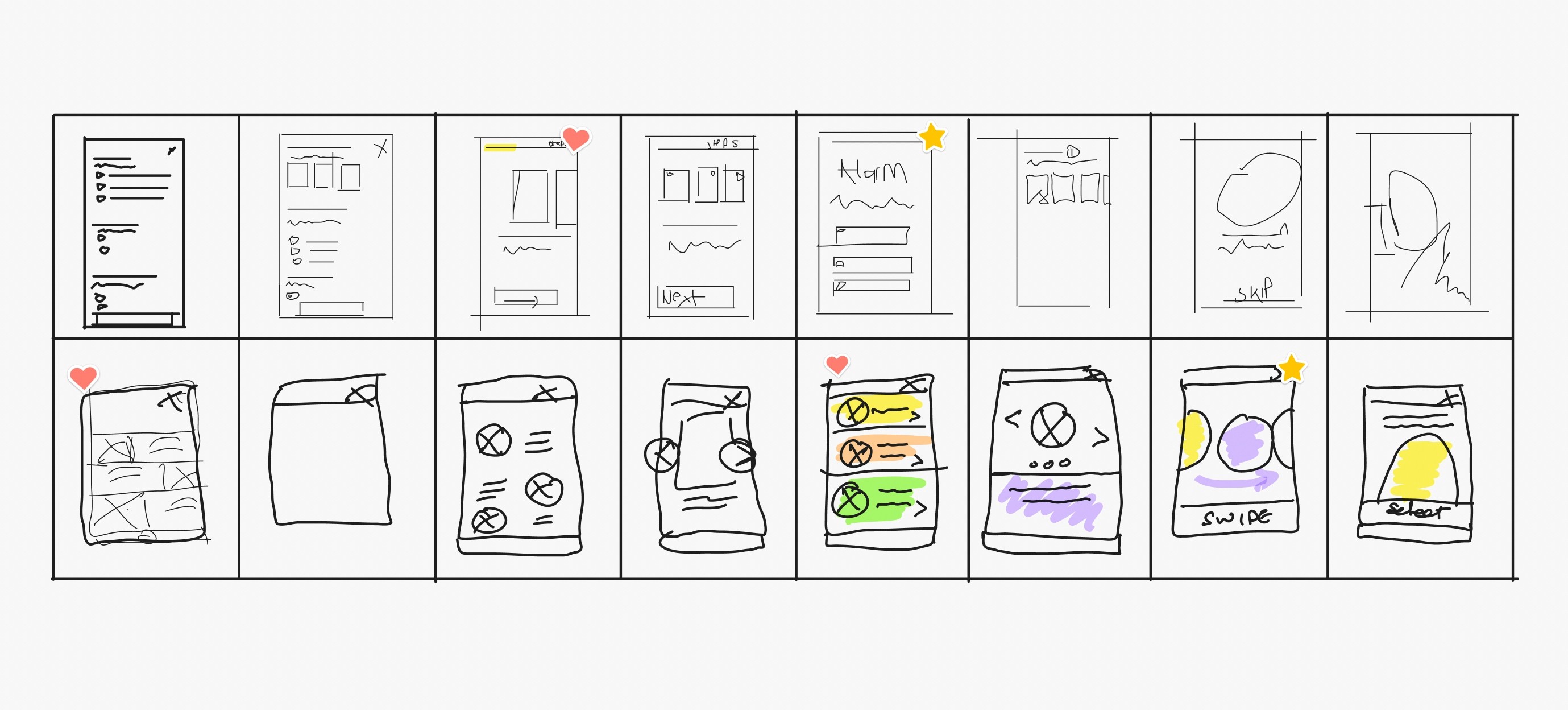
Rapid Prototyping
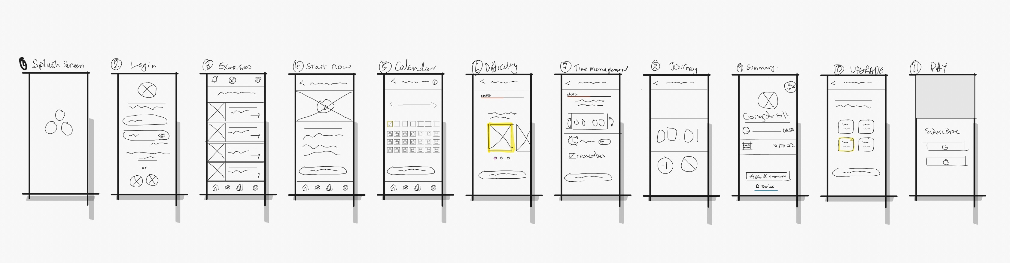
Having mapped an improved user flow I spent time rapidly prototyping a solution. Sketching helped me rapidly iterate on the original idea and visualise a solution without committing too early to hi-fidelity screens.
Styles & Components
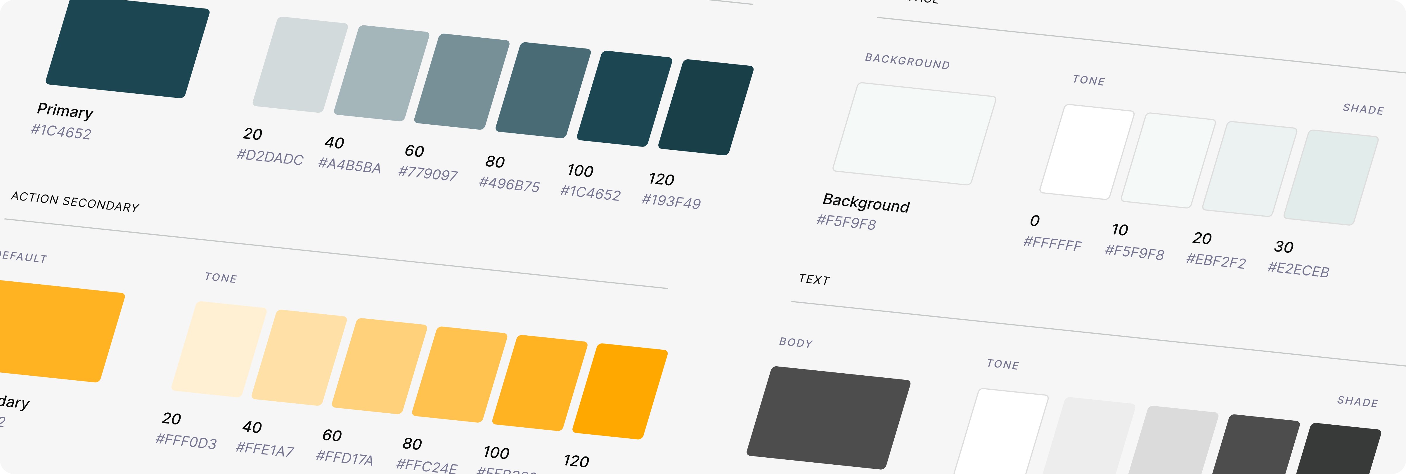
Before creating the hi-fidelity prototype I defined the product styles and interactive components in Figma to easily and quickly help me design consistently
High Fidelity Prototype
Below is the final version of the prototype that I created. I included interactions and transitions from Figma to match the products flow.
Usability Testing
With the prototype created I formed a testing script with scenario and tasks for the user to complete to validate the prototype with real users. To test the prototype I used Maze and gathered feedback following every task.
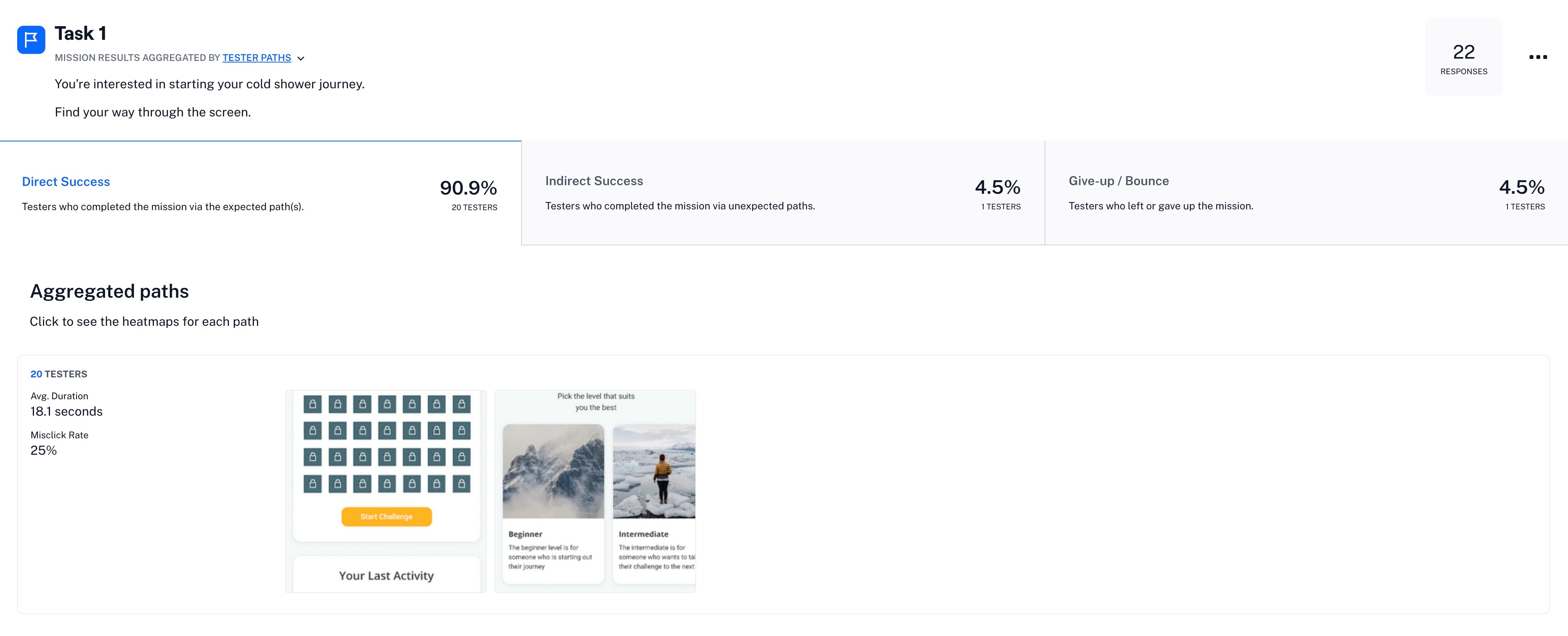
Key learnings
1. Start Challenge button is not prominent
2.CTA yellow color with white text was not very clear
Next steps
Apply the learnings of our Usability Tests to a new iteration of the prototype work to solve problems we noticed during our test.